Mobile is everywhere, and expanding fast. In 2013, nearly one third of global internet traffic came from mobile devices. That’s a 35% increase over 2012. We’re seeing a similar trend with our own clients (both e-commerce and non-e-commerce): mobile traffic in the 20% – 45% range. With numbers like these, having a mobile-friendly user experience is critical. We’ve explored all mobile solutions for e-commerce, and responsive web design continues to reign supreme. Check out our top 5 benefits of going responsive:
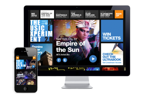
1. Multi-device user experience
No more zooming and shrinking. Users will actually be able to read and share content, browse pages, and purchase products easily. How convenient; and expected by buyers on the go.
2. Improved SEO
Only one URL to optimize! Prior to responsive web designs, online businesses would have to have a separate mobile version of their desktop site – basically two different sites – to focus their time, energy and budget on. A single responsive website instead of several versions allows search engines such as Google to crawl and index content on one URL. Additionally, Google recently announced its plans to penalize websites that are not optimized for mobile. Google wants its users to have a “positive user experience†and will downrank sites who do not follow their recommendations for building mobile optimized sites.
3. Easy(ier) to maintain
One website to manage means one code base, one CMS, one platform, one URL! No maintenance of multiple mobile enabled page layouts and shopping experiences. Think of the free time you’ll have!
4. Increased conversion rates
4 out of 5 mobile and tablet owners say they use these devices to shop. There’s a 61% chance that users will bounce if they have difficulty maneuvering your site on their mobile devices. Make your e-commerce site responsive and you’ll have the ability to capture those coveted conversions!
5. Staying relevant
Your competitors are going responsive and your customers are starting to expect sites to be mobile-friendly. Let’s face it, your business growth may depend on it.  Additionally, responsive designs adapt to screen size, not device. So, with the development of new technologies and devices, your website will still display properly. A bit of future proofing for your site.
The Bottom Line
Responsive sites are becoming the new norm. Don’t get left in the dust! Make your website responsive and reap the many benefits. At Accorin, we’ve designed and developed a lot of responsive sites over the last few years and perfected the nuances of doing it well. In fact, all of the new sites that Accorin designs and builds include a responsive element by default. Thinking about updating your site with a responsive design? We can help.